Dream works
|
|
|
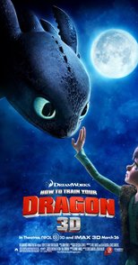
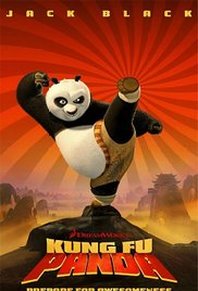
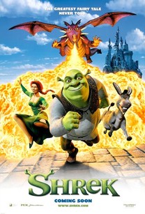
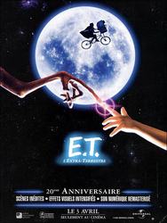
DreamWorks began in 1994 as an attempt by media moguls Steven Spielberg, Jeffrey Katzenberg and David Geffen together at SKG to create a new Hollywood studio of which they owned 72%. Currently, DreamWorks operates out of offices at Universal Studios. It is a very popular distribution company as it is well known for all children films. It's iconic logo makes people automatically recognise that this is their company and that the film will be good due to its representation. The use of the person on the moon shows that they control what people see on the outside world therefore can control what they watch when being apart of the Dream Work distribution company.
Loinsgate
|
|
|

|
|
Lionsgate is an industry leader in the marketing and distribution of packaged media and digital entertainment. It is an American entertainment company legally incorporated in Canada. The distribution company logo for Lionsgate starts off with mechanical parts which fit together to make the word 'Lionsgate' this indicates that the company uses different elements of media to package together their distribution to create the iconic logo with clouds as a background. Similarly to Dream Works the clouds represent freedom to be able to fly - above and beyond.
Universal
|
|
|
Universal is a leading american marketing and distribution company which is known worldwide. It was founded during April 1912 in California, America making it one of the oldest and most successful distribution companies in the world. Their iconic logo contains planet Earth with rays of light coming out of it which highlights the fact this company is worldwide. Their intro includes dramatic music which is used to make their company look powerful and make the audience feel empowered before the film starts. Universal stands out from other distribution companies because of their simple yet effective intro which truly grabs the audiences attention straight away.
20th Century Fox
|
|
|
20th Century Fox is, again, another famous American distribution company which was founded in 1935. The intro to promote their company is not like any other. They have decided to not go with the common theme of space, clouds or the sky which makes theirs unique to other brands. The logo for 20th Century Fox starts with the camera going around the large letters and gradually looking up from a low angle at the huge dominant letters. This allows the audience to recognise that this company is worldwide and powerful because behind the letters we can see a large landscape of a city or town suggesting that this brand is very superior. Also the fact that the letters are in the colour gold shows the wealth of the company. We associate the colour gold with love, passion, magic and courage. The music used in the intro is very memorable and recognisable which makes this company stand out among other distribution companies around the world.
