Trailer
When we were creating our trailer, we discussed how we were going to set out our work and we came to the conclusion that it needed to be consistent throughout, where all of the titles and shots were at the same quality. One way to make your product stand out from the rest is to have something unique about it, this could be from what idea the product is or how it is planned; this will allow people to remember the film and the products allowing you to stand out above other competitors and products. If the film or product is directed properly then people will recognize it, this can also be seen as free advertisement as people will talk about the product spreading it across the public and social media.
|
ICONIC IMAGE
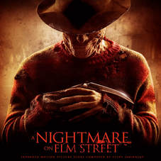
1983 A Nightmare on Elm Street is a massive icon within the horror genre due to the killer Freddy Krueger. He first appeared in Wes Craven's hit A Nightmare on Elm Street (1984) as a burnt serial killer who uses a glove armed with razors to kill his victims in their dreams, causing their deaths in the real world as well. His costume is particularly iconic as well as his killing technique and motive. This film has been an inspiration to many other horror films. |
|
|
ICONIC TEXT
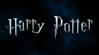
Harry Potter (Franchise) The first Harry Potter film out of J.K Rowling's popular childrens/teen novels was created in 2001. Ever since then the Harry Potter films were said to be one of the biggest movie franchises in the industry, gaining a $7.7 billion from all 8 films in the box office. The Harry Potter font is iconic due to the 'p' being the shape of a lighting bolt (representing an important symbol in the text). |
|
|
ICONIC POSTERS
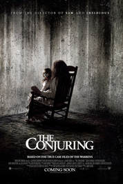
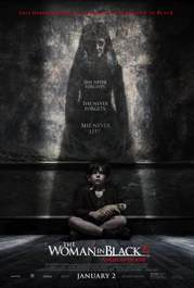
The Conjuring- This poster is extremely recognizable by horror movie fans due to the iconic image of the doll (also seen in Annabelle) .This poster is particularly effective because it shows only two of the main characters in the film. The girl in the chair holding the doll is significant as her face is not seen by the audience, making it more scary for the target audience. Also the doll in the poster is facing the audience which will create tension, making the audience want to watch the film. The fact the girl is not seen clearly but the doll is, makes the focus on the doll and how her role is going to be important in the film. The poster is effective by only allowing the audience to infer the plot whilst not much is given away. The Woman in Black- This poster is recognizable to many of the public and horror fans due to the shadow of the woman on the wall. The poster is effective as it clearly shows the villain and the victim in the film. Although this may give away some of the plot to the audience as they can see that her motive is to haunt little children, it makes the audience scared themselves due to the shape and look of the woman in black. We particularly feel sympathy for the little boy who we see as innocent and scared. |
|
Poster
Original Image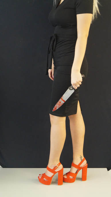
This original photo was taken right at the start of when we first produced out trailer, the photo was taken of Jasmine stood on a table against a black wall. We felt as though it represents our trailer really well as we have included the props which are also in our trailer. The image before it was made into the final poster was very dull as far as the colours go, so to make sure that this wasn't the case we spent a whole lesson experimenting with the colours to make them bright and vibrant like they are now. For example, the red heels looked slightly orange and faded on the camera which is not the sort of colour we were aiming for.
|
Final Poster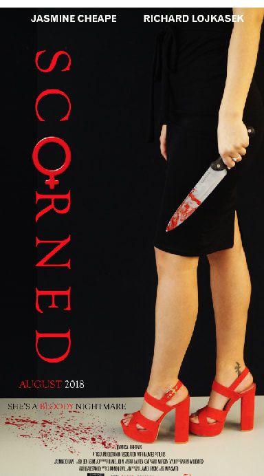
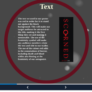
We took the original image and enhanced the colours by increasing the saturation in order to make the colour red more prominent. By doing this we are continuing the props and conventions we've used in our trailer. We decided not to change the background as we felt as though the black background was good at enhancing the colour red. We added the actors names at the top of the poster in white bold writing in order to attract our target audience and also to conform to the conventions of a movie poster. The main title on our poster 'Scorned' was added in on the black background in red in order for it to stand out and match the colour of the red heels. Like every film poster we included the distribution and production company logo so people know who it was produced and distributed by.
|
|
|
Magazine
Empire is a popular magazine that provides different news stories each week, reviews on recent films and what the upcoming films will be.
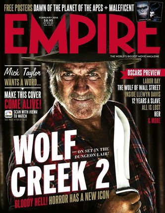
In this popular magazine cover they are focusing on the new "Wolf Creek 2" film. They have taken a staged scene image that is clearly showing the character and the background that will be scene in the film. They do this through the use of the main character and the death star which is faded into the background; these are important and iconic elements to the film.
They have kept a clear colour scheme of red and black with hints of gold to conform to the films poster.
Empire is a popular magazine that provides different news stories each week, reviews on recent films and what the upcoming films will be.
In this popular magazine cover they are focusing on the new "Wolf Creek 2" film. They have taken a staged scene image that is clearly showing the character and the background that will be scene in the film. They do this through the use of the main character and the death star which is faded into the background; these are important and iconic elements to the film.
They have kept a clear colour scheme of red and black with hints of gold to conform to the films poster.
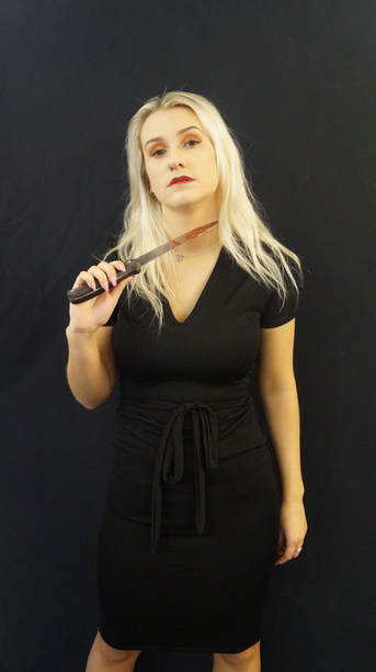
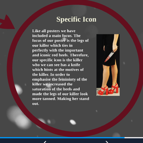
This was our final picture that we chose for the magazine, we picked this picture as we thought it didn't say a lot about the film and it was more of a mystery than it being obvious on what the film is about. We feel as though the dark colour scheme and iconic knife prop is the main focus of the poster. dark, the knife which conform to the conventions of horror. Also we decided to make the killer hold the knife to make the audience question whether she's the victim or villain of the film. But looking closely the knife touching her neck as she holds it could suggest to the audience that she's comfortable with the knife. As you can see, the killer is dressed in all black, these are the clothes used in the trailer, they are mysterious and dark, this is what we want the killer to come across as. Conclusion Going through all the products used throughout the trailer, i can conclude that the three items have been consistently used throughout the trailer. Firstly, The Scorned font and colour has remained the same throughout the process of creating these media products. The red signifies death and anger along with femininity and horror. Also the red text makes the black background stand out. Secondly, one of the main parts in the trailer is the killers weapon, in this case it's the knife and we have incorporated it into both the trailer and posters, this gives the audience an insight into the motives of our killer and the type of killing and gore they should expect to see. The third and most important part of these three iconic images is our killer herself. As this will be the main thing which will attract our audience. As the killer is a woman it means that it'll be the main talkative topic as it breaks conventions of horror. We incorporated her femininity to emphasize this as a theme throughout the project. |
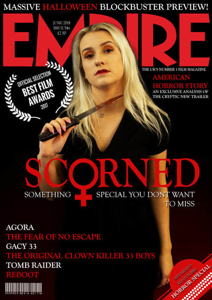
This is the final ,magazine cover with all of the advertisement on it, we added a lot more to the picture than just the killer on the front, this is to give the cover more of an impactful look when the viewers see it. All of the red titles on the poster are horror movie titles, we used red to make the titles pop out like areal professional poster. In order to make the magazine cover stand out we made sure to increase the saturation of red and our killer herself. This makes her look a lot clearer and will certainly attract our target audience. 
|
