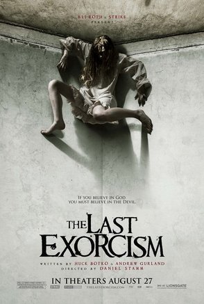
The Last Exorcism conforms to horror conventions by using dull and dark colours to represent an eery effect which is portrayed through the use of a possessed woman in the corner. This allows the audience to make an assumption before hand on what they are going to watch and whether it is worth it or not therefore the poster for a film plays a big part within the popularity rate. Another thing which successfully works within this poster is the font due to the sizing as it is irregular which could mimic the characters within the film. Also in small print the poster includes red font against the dull background which typically represent blood, violence and gore which could highlight to the audience that there may be scenes including these conventions.
The image which makes up the poster shows the main protagonist in the film who is presented in the poster as a villain/killer. The fact she has long dark hair over her face gives a sort of supernatural look like the killer in The Grudge. Although the main protagonist is shown in the poster it doesn't tell us too much about the narrative as she could be a victim in the plot. Underneath the girl in the centre of the poster it says 'If you believe in God you must believe in the Devil'. This slogan adds to the supernatural aspect of the film as it links to religion and peoples beliefs in unseen beings.
Therefore, this poster is effective as it contains many horror conventions but also makes the target audience want to know more about the narrative.
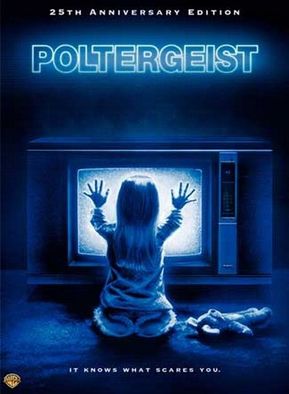
Poltergeist also conforms to horror conventions through the use of a vulnerable little girl being on their front cover as it enhances empathy for the child through the audience. The use of a child meets horror conventions as she's presented as alone and vulnerable. This also adds to the tension because she it also makes the film seem more scary and sadistic. The font colour and style match these themes of the TV which could imply that the film will be centred around technology.
Similar to The Last Exorcism, Poltergeist includes a small print at the bottom of the poster where it states 'It Knows What Scares You.', this gives a supernatural and psychological aspect to the poster and also hints at themes within the film which keeps the audience guessing. Also the fact this slogan has been used to directly scare the audience through the use of the pronoun 'you'.
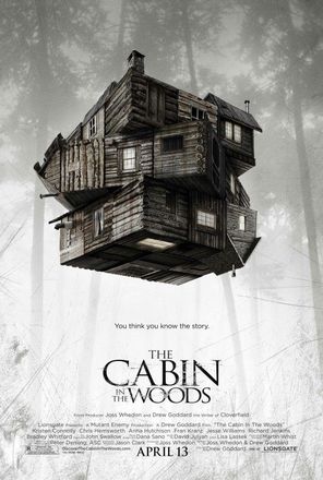
Cabin in the Woods use their poster to display how their film works by using a layered house to imply that the film is more complex than a usual horror. Lighting also plays a key part when analyzing the cabin in the woods poster due to the background being light and the cabin being dark and twisted as this allows the cabin to be the focal point within the poster. Also the cabin being the focal point of the poster and only being surrounded by forest shows how the house is isolated by the rest of society which conforms to horror conventions. The poster doesn't give any hints about protagonists or the narrative of the film which is rare for a horror poster and therefore is effective as it keeps the audience guessing. This is a very different film poster as the idea of it simply reflects the name of the movie.
Also the slogan 'You think you know the story.' adds an eerie effect to the poster. The use of the pronoun 'You' adds tension due to the fact it's direct to the audience and is telling them that they 'think they know the story' which will make the audience want to watch the film.
Also the slogan 'You think you know the story.' adds an eerie effect to the poster. The use of the pronoun 'You' adds tension due to the fact it's direct to the audience and is telling them that they 'think they know the story' which will make the audience want to watch the film.
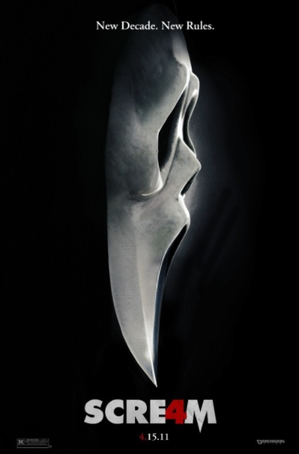
Scream has the reputation of a classic slasher horror film. The mask symbolises a knife and therefore confirms that the film is a slasher. By featuring the mask on the poster it allows the audience to recognise that this is the sequel to previous scream movies. The A in scream is highlighted in red as a number 4 to show this is the fourth scream made and the colour red has many connotations linking to blood and death. It is also duplicated within the date to show when the film will be released. Another thing which enables the poster to have more of an 'eerie' feel is the slogan at the top 'New Decade. New Rules' which points out to the audience that this scream will have more consequences allowing the to feel more vulnerable and scared.
By comparing this poster to others we can see that it has a more basic design. With a plain black background and the simple mask, we can instantly tell that the film has a good reputation as it doesn't need a high maintenance poster to emphasise the films release. Also the slogan 'New Decade. New Rules.' has been used to make the audience feel uncertain about what will happen in the film. The repetition on the word 'New' suggests they want to attract both their old audiences who have been following the films, but also new members who will be attracted to the film and it's 'new' narrative.
By comparing this poster to others we can see that it has a more basic design. With a plain black background and the simple mask, we can instantly tell that the film has a good reputation as it doesn't need a high maintenance poster to emphasise the films release. Also the slogan 'New Decade. New Rules.' has been used to make the audience feel uncertain about what will happen in the film. The repetition on the word 'New' suggests they want to attract both their old audiences who have been following the films, but also new members who will be attracted to the film and it's 'new' narrative.
|
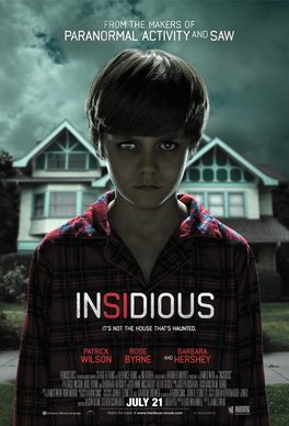
The little boy featured on the poster conforms to horror connotations as children in horror films represent naivety and weakness. The strange colour of his eyes makes him look evil and possessed, therefore suggesting the film will be centered around the paranormal sector. The setting in the background suggests that the film is unsettling and dark due to the dark clouds- this is known as pathetic fallacy in which the weather represents or foreshadows a certain mood or event. Also we can see that the little boy is stood in front of a house which gives us a hint on the sort of settings we will see throughout the film. The setting of a normal house has been used as the audience will be able to relate to this setting and therefore make them more scared.
The slogan "IT'S NOT THE HOUSE THAT'S HAUNTED" has been used to confuse the audience and leave them guessing what is "HAUNTED". It is common to think of a place or building to be haunted but this slogan emphasizes the fact that it's not the "HOUSE" which, again, will leave the audience guessing. |
