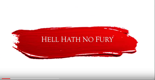
Our film trailer goes against the conventions of a horror film as our titles have a white background. Our trailer includes dark and eerie settings which means most of our trailer consists of low-key lighting. Therefore, our titles act as a juxtaposition of the shots in our trailer, making them stand out. Also the use of red is especially significant because it's the main colour used in our trailer, due to the connotations of it representing femininity but aso blood and death which are all relevant motifs used throughout our trailer.
The font used in our trailer is particularly relevant because we chose to make it look basic and simple yet effective. Originally we were going to make the font thicker and more bold in order to make it stand out but because of the red blood splatter making the white text stand out, we felt this wouldn't be necessary when creating our horror.
The font used in our trailer is particularly relevant because we chose to make it look basic and simple yet effective. Originally we were going to make the font thicker and more bold in order to make it stand out but because of the red blood splatter making the white text stand out, we felt this wouldn't be necessary when creating our horror.
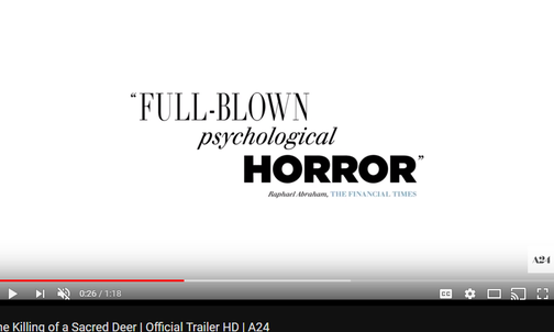
When researching the titles and what to choose we specifically found that white backgrounds were not commonly used in trailers, however one trailer which did use it was The Killing of a Sacred Deer. We felt that the black and white was basic yet effective in a trailer as it made the writing stand out.
The main reason we wanted to recreate this was due to the fast it makes the trailer look more sophisticated and professional.
The main reason we wanted to recreate this was due to the fast it makes the trailer look more sophisticated and professional.
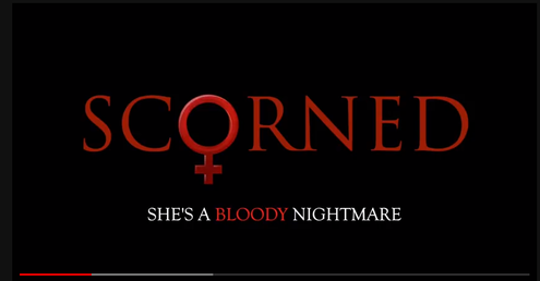
We deliberately aimed to create a black background for the title of our film which comes at the end of the trailer. We did this in order for their to be a significant contrast between the red and white credits which come earlier in our trailer. However, even in the title clip we wanted to keep the red font colour due to the fact we wanted this to be the iconic part of the trailer. If the audience remembers parts of the trailer being red then they are more likely to remember to the name of the film and come and see it at the box office.
The title of our horor is again in a simple and effective font. We did this so that with the female symbol as the O, it wouldn't look too complex and drift from the true meaning of the title. Also the slogan at the bottom of this title continues the theme of red and white with the word "bloody" in red. Therefore, this conforms to the expectations our target audience will have for a horror trailer because it includes a black background with deep red writing.
The title of our horor is again in a simple and effective font. We did this so that with the female symbol as the O, it wouldn't look too complex and drift from the true meaning of the title. Also the slogan at the bottom of this title continues the theme of red and white with the word "bloody" in red. Therefore, this conforms to the expectations our target audience will have for a horror trailer because it includes a black background with deep red writing.
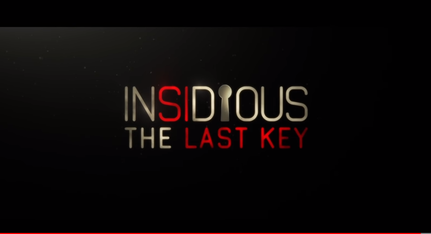
The title of Insidious is particularly relevant to our research as this is what we want to recreate. The fact the title includes the red font on certain letters is something we wish to recreate. Also the fact a key has been used to replace the 'i' is what we have done with our title, by using the female symbol. By adding symbols into the title of the film emphasises the meaning and main theme of the film.
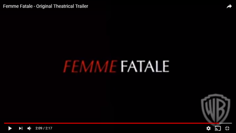
Here, the Femme Fatale title conforms the type of text we are trying to portray in our media product as the theme of red stands out. Also the fact the two words have contrasting fonts is effective as it separates the meaning of the title.
Inspiration for font choices:
