Trailer
Using Conventions:
The first convention we used in our trailer was the use of slow dramatic titles. We decided to use this classic horror convention as the pace increases gradually which adds to the suspense and tension to ensure the audiences attention is captured throughout the trailer. Our titles used in the trailer were made to conform to classic horror conventions by keeping the audience guessing. The title "Hell Hath No Fury " conforms to other horror films which relate their catchphrase to religion and classic ideologies. The word "Hell" relates to these religious beliefs but could be seen to be a hint of the killers motive. Also the actual background of our trailer titles used real media products as inspiration due to the use of bright red blood which is commonly used in slasher horror film trailers to suggest blood and gore will be used in the horror film. An example of a read media product which we took inspiration from is Carrie due to the use of blood in the title and also the font which is simple yet effective.
The first convention we used in our trailer was the use of slow dramatic titles. We decided to use this classic horror convention as the pace increases gradually which adds to the suspense and tension to ensure the audiences attention is captured throughout the trailer. Our titles used in the trailer were made to conform to classic horror conventions by keeping the audience guessing. The title "Hell Hath No Fury " conforms to other horror films which relate their catchphrase to religion and classic ideologies. The word "Hell" relates to these religious beliefs but could be seen to be a hint of the killers motive. Also the actual background of our trailer titles used real media products as inspiration due to the use of bright red blood which is commonly used in slasher horror film trailers to suggest blood and gore will be used in the horror film. An example of a read media product which we took inspiration from is Carrie due to the use of blood in the title and also the font which is simple yet effective.
Another convention we decided to include was the use of industrial filters to make clips and scenes darker and more eerie. This is important for creating an effective scary atmosphere for the audience. Some shots in our horror trailer were filmed in daylight which means they have natural bright lighting. However, we decided to use darkening filters and colour correction on Final Cut in order to make the shots darker whilst still having the important colour theme of red visible and bright. Although, we decided not to use much high key lighting in our trailer as we felt as though this would detract from the focus of our trailer which is to scare and attract our target audience. Therefore, we decided to use the conventions of a dark trailer with mainly low-key lighting and took inspiration from horror film trailers such as Lights Out.
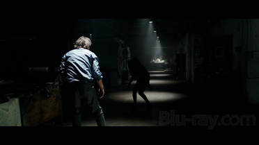
We decided to use the convention of a trailer which starts with a slow pace and then gradually increases as the trailer goes on. The beginning of our trailer begins with multiple shots of our killer applying makeup cosmetics such as nail varnish and lipstick which builds the suspense to the audience as they are unsure of whether this character will be the victim or the killer. These shots are slow paced in order to build the tension and the sound we put over these shots compliments the pace perfectly. However, as the victim is revealed the pace begins to speed up which builds the suspense and makes our audience desperate to see what happens. This is similar to the Happy Death Day trailer which conforms to this convention of pace as when the victim realises her fate the shots are sped up along with the music.
Developing Conventions:
We decided that a linear sequence would not be suitable for our trailer. This is due to our planned storyline which fitted a non-linear sequence more, due to the fact we could include a variety of shots which would hint at many scenes within our film in a disjointed way which will grip our audience and mean they won't know the full narrative before watching the film in the box office. For this idea we took inspiration from successful trailers such as Conjuring 2, which includes shots from throughout the film which allows the audience to guess the outcome, whilst still having a basic idea of the narrative. We developed this convention of a non-linear trailer by including a range of shots in different orders. For example, in our trailer our victim is seen inside the car boot before we've seen a variety of shots of how the victim was killed using a knife.
We decided that a linear sequence would not be suitable for our trailer. This is due to our planned storyline which fitted a non-linear sequence more, due to the fact we could include a variety of shots which would hint at many scenes within our film in a disjointed way which will grip our audience and mean they won't know the full narrative before watching the film in the box office. For this idea we took inspiration from successful trailers such as Conjuring 2, which includes shots from throughout the film which allows the audience to guess the outcome, whilst still having a basic idea of the narrative. We developed this convention of a non-linear trailer by including a range of shots in different orders. For example, in our trailer our victim is seen inside the car boot before we've seen a variety of shots of how the victim was killed using a knife.
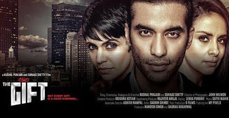
We also developed conventions of psychological horror films. For example, the murders and motives in psychological horrors are more complex and require the audience to think more about what is going on. The murders will not include huge amounts of blood and gore (if any) but more torturing of the victim in different ways. The killers in the films are often sociopaths, psychopaths and pedophiles which explains why the genre can often be mistaken for a thriller. For this reason lots of Psychological horror films are based on true stories of killers with mental illnesses. An example of this is Silence of The Lambs including Hannibal Lector. However, we developed this convention as, although, we focussed on the motives of a killer who could be described as a psychopath or sociopath we didn't want our narrative to be too complex for our audience which is a contrast to thriller films such as The Gift which conform to this convention. This is shown in our trailer through only including two characters of a male and a female. However, Psychological horrors are generally more subtle compared to traditional horror. It contains less violence but focuses on sexuality and relationships with men and women. These types of films aim to disturb their audience mentally by creating discomfort and fear. By scaring the audience in this way it's somewhat more realistic and is something we portrayed in our trailer.
|
|
Challenging Conventions:
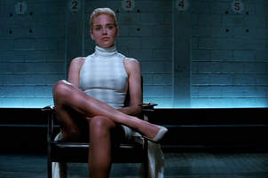
The main horror we challenged was not having a male killer in our trailer. We wanted to challenge this convention because we felt as though the film industry was lacking a psychological horror film with a female femme fatale as we see many female killers in horrors such as The Grudge and Annabelle but we particularly wanted to focus on the motives of our female protagonist and her past relationships. The film industry hasn't seen a successful horror film with a female killer like ours since the film Basic Instinct in 1992.
The main horror we challenged was not having a male killer in our trailer. We wanted to challenge this convention because we felt as though the film industry was lacking a psychological horror film with a female femme fatale as we see many female killers in horrors such as The Grudge and Annabelle but we particularly wanted to focus on the motives of our female protagonist and her past relationships. The film industry hasn't seen a successful horror film with a female killer like ours since the film Basic Instinct in 1992.
|
|
The sexuality of our female killer is a key part of our killer which allows both males and females to be attracted to it, this is something which we were also . We deliberately casted a pretty, white, blonde killer which completely goes against the stereotypes of pretty women. Therefore, our use of props, as part of mis-en-scene, of red nail varnish, lipstick and heels all conform to stereotypes of pretty women wearing red but instead of using deep red to show vulnerability we used it to represent blood and cynical motives of our female killer.We decided to go against Wes Craven's theory in order to emphasise women's equality in today's society and to challenge traditional stereotypes of women being weak and vulnerable. This will attract young audience members in our postmodern society who enjoy having their expectations played with, according to Hayward.
Also, our trailer challenges horror conventions by following Wheeler Winston Dixon's theory on 'sites of activity' where you are able to understand the theme of the trailer but you never create a connection with any of the characters, yet still see their deaths. We took inspiration from films such as 'The Gallows and 'Severance' in this way. This therefore challenges conventions by not showing the relationship between the characters fully but showing the awful killing. This is not always common in horror trailers as it's often done the other way round with the motive and relationship being hinted at in the trailer in order to grip the audience and want to see the film to answer their questions.
By having a female killer who uses stereotypically 'male' killing techniques of cutting with a knife is something which challenges horror conventions. Female killers are not often associated with gory murders including weapons due to successful horror films such as You're Next (2013) which conform to the stereotypes of having a male killer who kills with a knife. We wanted to go against this convention to show that some women are more aggressive than people may think and hint at the motive of romance which causes her to cut up a man who she could've had a sexual history with. Therefore, our use of props, as part of mis-en-scene, of red nail varnish, lipstick and heels all conform to stereotypes of pretty women wearing red but instead of using deep red to show vulnerability of a sexual female victim we used it to represent blood and cynical motives of our female killer. Therefore, using a female killer challenges horror conventions and is successful in attracting our audience.
Poster
|
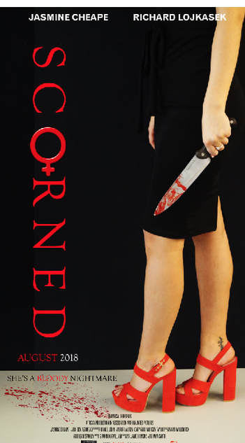
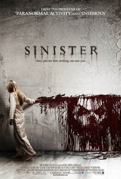
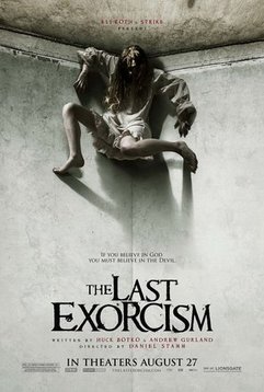
When creating our poster we decided to use a dark colour scheme in order to match and conform to horror conventions. Although posters such as The Last Exorcist and The Cabin in the Woods Along contain lighter backgrounds we felt a darker colour scheme would be more effective because many of our shots within the trailer are dark and contain shadow so a darker colour scheme would show continuity between our media products. Along with the black background we used for our poster we also continued to use red titles and props similarly to our trailer which adds to the colour scheme. By doing this our poster conforms to real posters such as Sinister which use blood as the centre of the shot in order match the style of killing in the film. We feel as though the red and black colour scheme used, presents our killer as feminine, but also evil and villainous which is how we want her to be represented. By doing this both male and female 16-25 year olds would be attracted to our film which makes it conform to other real media products.
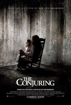
In our poster we wanted to both challenge and conform to media products by including our killer in the poster. We have conformed to media products by including our killer as the main subject of our poster, by doing this we are conforming to popular horror films such as The Conjuring and Nightmare on Elm Street. By doing this our poster is hinting at the killer and the events which will occur in the film in order to attract our target audience. We then developed the convention by including the weapon which the killer uses. This, therefore, hints at the motive of the killer and is supported by the blood on the knife. |
Furthermore, the fact we have only focussed on the legs of the killer, not only shows we are hiding the full identity of the killer but that we want to focus on her femininity. We have used props and symbols to show this which conforms to real media products such as Silence of the Lambs and Poltergeist which includes symbols to compliment the narrative of the film. In our poster the red heels and female symbol both present our narrative as being based on gender and identity. Therefore, our poster conforms to the conventions of a movie poster by including the main villain from the film whilst also hinting at the narrative through props and symbols.
We chose to conform to horror conventions by creating a portrait movie poster. We chose this size and position in order to emphasise the shape of the human body, we felt a landscape image wouldn't link to the concept of our trailer as we want to emphasise the femininity of our protagonist. Therefore, by creating a portrait poster makes our media products coherent which conforms to mainstream horror films which have a clear way of advertising the product, using a certain character or prop. The image we chose allowed our target audience to have a clear idea about what our poster will be about, whilst also being aesthetically pleasing. When adding the text on the poster we decided to make it traditional by adding actors names at the the top and small print at the bottom. This allows people to clearly see the actors in the movie which could attract more consumers to watch our trailer, and thus want to watch the film. Credits are kept at the bottom of the poster in small print and the title to the left of the image due to how the image is placed.
The font we chose for our movie poster was 'Didot' which is a basic and clear font. We didn't want to use a font that's too fancy as they can often be hard to read and can ruin the aspect of our poster. A clear and basic font means the attention isn't taken away from the iconic image and props on the poster which aim to be memorable and make people want to watch the film. We wanted our poster to represent our trailer in all aspects so we didn't want to over complicate it. We took inspiration from the posters below. This may be a developing convention as many movie posters have clear fonts, whereas others may rely on their font choice to represent their movies, such as The Ring and Poltergeist. However, we challenged conventions of horror movie posters by the title being on the side and not straight. This is significant as we aimed to keep the female symbol facing down in order for it to stand out. We also found doing this with the writing supported the fact her legs were the main focus of the poster.
|
|
|
Magazine
|
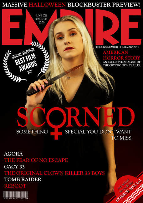
We went with red as the accent colour throughout the magazine cover and for the main title as we wanted to link it with the accents we have used within the film trailer. This follows your conventional horror magazine cover as red is a symbolic colour for horror. By using the colour red it represents blood and femininity, this is what creates a sense of fear amongst the audience. We used white as it stands out in front of the dark background and has connotations of purity. Our magazine cover therefore conforms to the conventions of normal magazine covers as we've included dark undertones. Even our killers dress is black which makes it blend in with the background.
We felt it was very significant to use the prop of a knife in our poster which not only link to our trailer but also typical horror conventions. By doing this the magazine cover will attract the target audience by contrasting the feminine character with a knife. Some of the public may think the way she holds the knife is her acting as the victim but it is actually her as the killer. This goes against conventions of horror, making the audience confused and thus attracted to watch the film as a knife is commonly known as a male way to kill. Our magazine cover is then making a stand about female victims in horror, making it no longer a niche film but a mainstream film. Magazine covers rarely actually use a feature shot from the movie trailer itself as without the rest of the images there is no context to it. We decided to only use one character on the cover opposed to two as it allows the audience to focus on only one character and it shows that the film is about only one killer. When positioning Jas in the image we wanted her to be seen with a knife as the main weapon. To get our magazine image related to the trailer we therefore included the exact dress she wore in the trailer when killing her victim. |
|
|
|
|
We positioned the main title of the magazine in the bottom right of the cover so that it allows the majority of the audience's focus to be on the actual page and image. This follows your standard conventional magazine cover style as titles are either placed at the top or the bottom of the magazine cover. This is so that customers can clearly see what they are purchasing. We placed the title at the bottom right overlapping our killers body, but leaving her face and the prop of the knife untouched. We did not want to obstruct the image of Jasmine as this is a conventional measure which other magazine cover companies use. We included some additional extras to our magazine cover such as a rating mark from 'the world's best movie reviews'. These were essentially our finishing touches to the cover which gives it a more professional look. At the bottom of the magazine I have added some other horror movie names as advertisement. This is what follows the standard conventional style as they all feature advertising for movies that are not featured on the cover.
We decided to use the fonts featured on a conventional magazine cover. We didn't want to stray too far from convention because that would have made the cover look unprofessional and wouldn't go with the horror genre. We used a template for the title as to make it seem like it was made by the company 'Empire' and we recoloured it so that it would go with our colour scheme. The title of the magazine is larger than the rest of the text, with our movie title being only a fraction smaller and the rest of the text ranges from around size 26-40 (with the whole cover being A3 sized). We decided to follow convention with the size of the text because straying too far from that would have created an unbalanced cover and given it an unprofessional feel. We developed this convention by positioning the text a little bit differently from a conventional horror movie cover.
Magazine covers such as Scream and Fangoria are a few of the magazine covers that we took inspiration from in order to create and develop our magazine cover to as effective as possible. The aim was to make our magazine poster dark and mysterious and to be the best horror magazine cover around. We decided to use Jasmine to pull a lifeless facial expression to ensure that a lifeless vibe is given off to the audience when they see the cover. We wanted our magazine cover to look the the Scream magazine shown above about the walking dead series. It shows cast members on it which we decided was effective as it makes the cover more appealing if there are more individuals on it. Our layout was to have one main image (Jasmine) and then a lost of text referring to content to be found in the magazine.
Having more than one person may challenge conventions as magazine covers commonly have one main focus or character on the front, we instead wanted to conform to the convention of having one focus. By doing this it links to the narrative of our horror film as we only have one main killer.
