What technology did you use?

|
|
QuickTime Player is a multimedia framework program, capable of handling various formats of digital video, picture, sound. However I used it to screen record and document how I used the variety of techniques shown in a video format. For this particular evaluation page we are able to show how our techniques and how we created our media products.
|
|
Final cut allows us a media group to edit a series of non-linear video footage. It is a seamless step up from iMovie and includes advanced colour grading and HDR support. By including a timeline it allows people to easily experiment with their story ideas by being able to easily move and trim clips without collisions. It also allows compound clips within the footage to bundle separate video and audio clips into a single movable package. Final cuts performance is built on a high performing and powerful 64-bit architecture which allows us to work with more complex projects, larger fame sizes and more effects. All of these qualities of final cut enable us to produce the best horror trailer within A2.
The video below is a self made demonstration of screen casting, this shows many examples of what type of things we used as a group and also how we used and imported the information:
The video below is a self made demonstration of screen casting, this shows many examples of what type of things we used as a group and also how we used and imported the information:

|
|
This video shows a range of techniques we used on Weebly to create our website with planning, audience research and personal research. The video demonstrates how we would go about constructing one of our actual pages and shows how our website is successful.
|
|
|
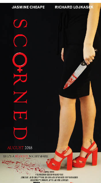
During the creation of our poster and magazine in photoshop, we used a variety of techniques including cropping, adding and editing fonts and editing the background of the image. We used a quick time player to show how we developed our poster and magazine through photoshop and the different techniques which was included in this.
|
Whilst completing our poster, it was vital we cropped and adapted the image in order for it to have a full effect and stand out from others. When taking our trial photos for our magazine and poster we used a range of images from portrait to landscape and also using a table as a prop to enable us to get the perfect black background in order for Jasmine's red heels and bloody knife to stand out. We also used the female gender sign within our title representing the 'o' within Scorned as it allowed us to play with the idea that our trailer is a female empowered film and therefore she rules everything. Whilst doing this, we edited the font of our title Scorned a few times due to at first we wanted to give our title the effect of lipstick smudge however this did not allow our poster to stand out as it was sharp nor tall therefore it looked as though we had lacked something within our trailer making people not want to watch it due to it looking dysfunctional. When creating our background, we didn't want a lot going on in the background as we wanted the audiences focus to be on Jas's red heels and bloody knife therefore we used a plain black sheet as our background which made the whole poster stand out more. By creating and adapting the text we were able to make our poster conventional. We used the text Didot for the title and slogan and a bolder conventional text for the actors names in order for them to stand out. I transformed the text layers and made them smaller to a more appropriate size and moved them into the correct places. |
